

keras训练曲线,混淆矩阵,CNN层输出可视化
发布于2019-09-11 16:20 阅读(3599) 评论(0) 点赞(23) 收藏(5)
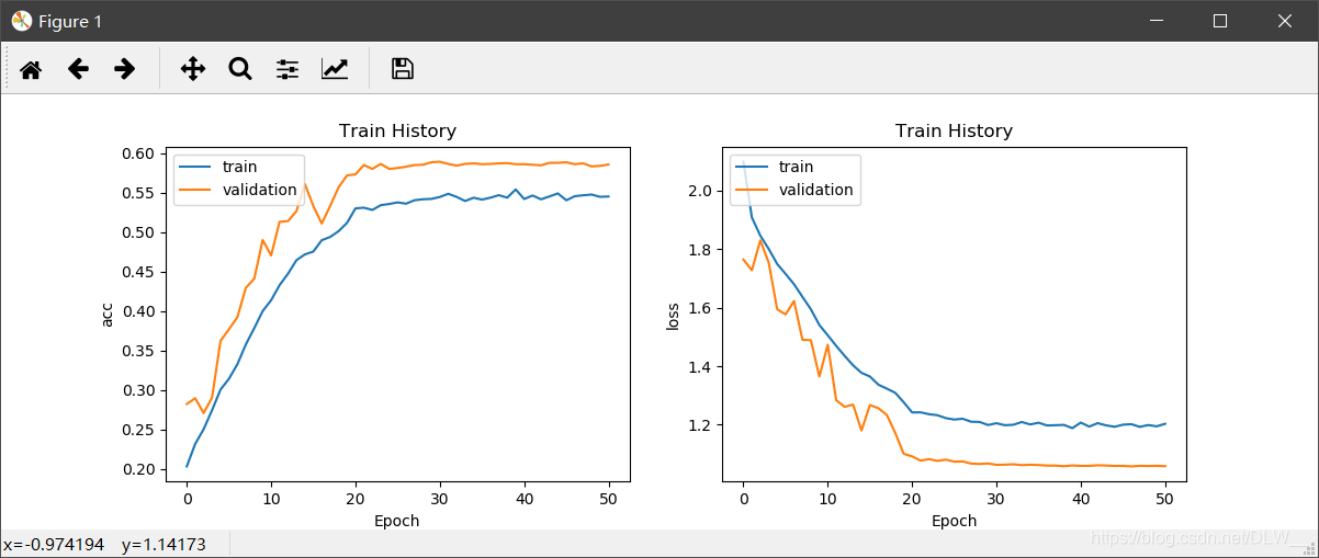
训练曲线
def show_train_history(train_history, train_metrics, validation_metrics):
    plt.plot(train_history.history[train_metrics])
    plt.plot(train_history.history[validation_metrics])
    plt.title('Train History')
    plt.ylabel(train_metrics)
    plt.xlabel('Epoch')
    plt.legend(['train', 'validation'], loc='upper left')

# 显示训练过程
def plot(history):
    plt.figure(figsize=(12, 4))
    plt.subplot(1, 2, 1)
    show_train_history(history, 'acc', 'val_acc')
    plt.subplot(1, 2, 2)
    show_train_history(history, 'loss', 'val_loss')
    plt.show()
- 1
- 2
- 3
- 4
- 5
- 6
- 7
- 8
- 9
- 10
- 11
- 12
- 13
- 14
- 15
- 16
- 17
效果:
plot(history)
- 1
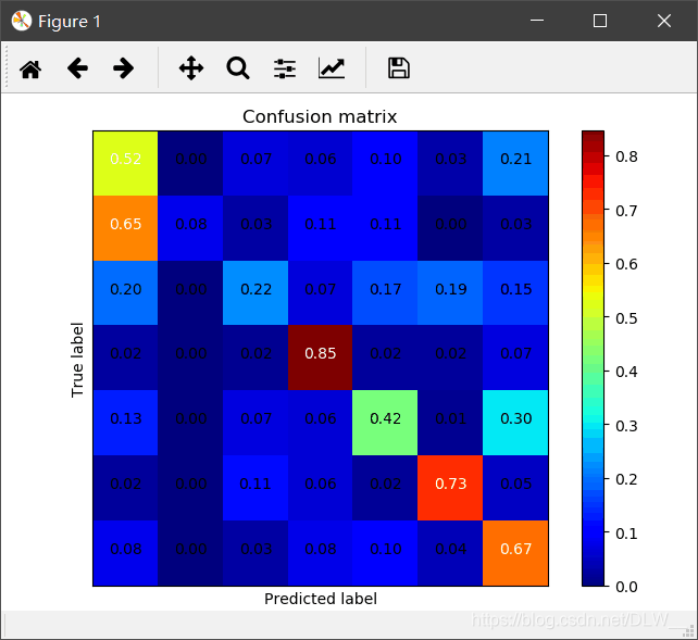
混淆矩阵
def plot_confusion_matrix(cm, classes,
                          title='Confusion matrix',
                          cmap=plt.cm.jet):
    cm = cm.astype('float') / cm.sum(axis=1)[:, np.newaxis]
    plt.imshow(cm, interpolation='nearest', cmap=cmap)
    plt.title(title)
    plt.colorbar()
    tick_marks = np.arange(len(classes))
    plt.xticks(tick_marks, classes, rotation=45)
    plt.yticks(tick_marks, classes)
    thresh = cm.max() / 2.
    for i, j in itertools.product(range(cm.shape[0]), range(cm.shape[1])):
        plt.text(j, i, '{:.2f}'.format(cm[i, j]), horizontalalignment="center",
                 color="white" if cm[i, j] > thresh else "black")
    plt.tight_layout()
    plt.ylabel('True label')
    plt.xlabel('Predicted label')
    plt.show()

# 显示混淆矩阵
def plot_confuse(model, x_val, y_val):
    predictions = model.predict_classes(x_val)
    truelabel = y_val.argmax(axis=-1)   # 将one-hot转化为label
    conf_mat = confusion_matrix(y_true=truelabel, y_pred=predictions)
    plt.figure()
    plot_confusion_matrix(conf_mat, range(np.max(truelabel)+1))
- 1
- 2
- 3
- 4
- 5
- 6
- 7
- 8
- 9
- 10
- 11
- 12
- 13
- 14
- 15
- 16
- 17
- 18
- 19
- 20
- 21
- 22
- 23
- 24
- 25
- 26
- 27
其中y_val以one-hot形式输入
效果:
x_val.shape	# (25838, 48, 48, 1)
y_val.shape	# (25838, 7)
plot_confuse(model, x_val, y_val)
- 1
- 2
- 3
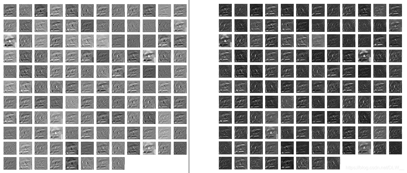
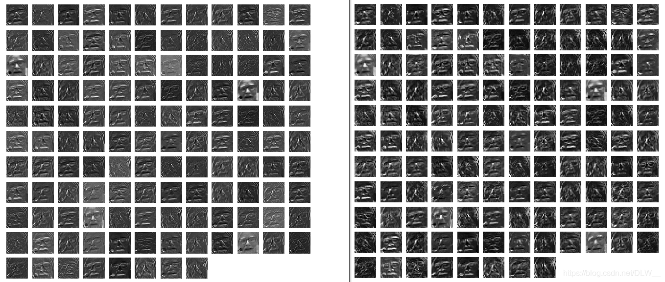
CNN层输出可视化
# 卷积网络可视化
def visual(data, num_layer=1):
    # data:array数据
    # layer:第n层的输出
    data = np.expand_dims(data, axis=0)     # 开头加一维
    layer = keras.backend.function([model.layers[0].input], [model.layers[num_layer].output])
    f1 = layer([data])[0]
    num = f1.shape[-1]
    plt.figure(figsize=(8, 8))
    for i in range(num):
        plt.subplot(np.ceil(np.sqrt(num)), np.ceil(np.sqrt(num)), i+1)
        plt.imshow(f1[0, :, :, i] * 255, cmap='gray')
        plt.axis('off')
    plt.show()
- 1
- 2
- 3
- 4
- 5
- 6
- 7
- 8
- 9
- 10
- 11
- 12
- 13
- 14
num_layer : 显示第n层的输出
效果
visual(data, 1)	# 卷积层
visual(data, 2)	# 激活层
visual(data, 3)	# 规范化层
visual(data, 4)	# 池化层
- 1
- 2
- 3
- 4
所属网站分类: 技术文章 > 博客
作者:iuie9493
链接:https://www.pythonheidong.com/blog/article/107594/b9bfae5254b5fe280d2e/
来源:python黑洞网
任何形式的转载都请注明出处,如有侵权 一经发现 必将追究其法律责任
昵称:
评论内容:(最多支持255个字符)
---无人问津也好,技不如人也罢,你都要试着安静下来,去做自己该做的事,而不是让内心的烦躁、焦虑,坏掉你本来就不多的热情和定力