

pyecharts学习笔记 - 版本 version 1.2.0 - 2019.6.1
发布于2019-08-07 12:35 阅读(1088) 评论(0) 点赞(4) 收藏(3)
pyecharts 是一个用于生成 Echarts 图表的类库。
echarts 是百度开源的一个数据可视化 JS 库,主要用于数据可视化。pyecharts 是一个用于生成 Echarts 图表的类库。实际上就是 Echarts 与 Python 的对接。
使用 pyecharts 可以生成独立的网页,也可以在 flask , Django 中集成使用。
pyecharts安装
pip install pyecharts

# 安装地图

pip install echarts-countries-pypkg

pip install echarts-china-provinces-pypkg

pip install echarts-china-cities-pypkg

# 安装主题

pip install echarts-themes-pypkg
- 1
- 2
- 3
- 4
- 5
- 6
- 7
- 8
- 9
- 10
- 11
- 12
- 13
在jupyter notebook中交互式显示图表
- 先对全局notebooktype进行设定
from pyecharts.globals import NotebookType,CurrentConfig
CurrentConfig.NOTEBOOK_TYPE = NotebookType.JUPYTER_NOTEBOOK
- 1
- 2
- 使用render_notebook()来进行显示
图表结构
设置样式
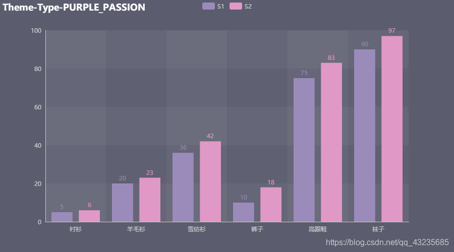
可以自己设置主题,也可以使用已经设定好的主题,设定方式如下:
from pyecharts.globals import ThemeType
# 基础数据
xray = ["衬衫", "羊毛衫", "雪纺衫", "裤子", "高跟鞋", "袜子"] # x轴数据
y1 =  [5, 20, 36, 10, 75, 90]
y2 =  list(np.round(np.array([5, 20, 36, 10, 75, 90]) + np.random.rand(6)*10))
# y轴数据 ,无法直接使用numpy对象,转为list进行处理

bartype = Bar(init_opts=opts.InitOpts(theme = ThemeType.PURPLE_PASSION))
bartype.add_xaxis(xray)
bartype.add_yaxis("S1",y1)
bartype.add_yaxis("S2",y2)
#bartype.reversal_axis()
bartype.set_global_opts(title_opts=opts.TitleOpts("Theme-Type-PURPLE_PASSION")
                   ,toolbox_opts = opts.ToolboxOpts(is_show = True))
bartype.set_series_opts(label_opts=opts.LabelOpts(position = "top"))
bartype.render_notebook()
- 1
- 2
- 3
- 4
- 5
- 6
- 7
- 8
- 9
- 10
- 11
- 12
- 13
- 14
- 15
- 16
- 17
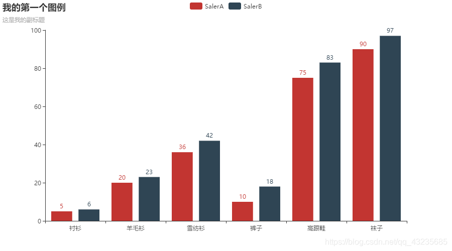
柱状图
from pyecharts.charts import Bar
from pyecharts import options as opts
%matplotlib inline
# 基础数据
xray = ["衬衫", "羊毛衫", "雪纺衫", "裤子", "高跟鞋", "袜子"] # x轴数据
y1 =  [5, 20, 36, 10, 75, 90]
y2 =  list(np.round(np.array([5, 20, 36, 10, 75, 90]) + np.random.rand(6)*10))
# y轴数据 ,无法直接使用numpy对象,转为list进行处理

# 生成实例化对象
bar = Bar()
# 个人比较习惯使用直接调用
# 也可以使用链式调用
bar.add_xaxis(xray)
bar.add_yaxis("SalerA",y1)
bar.add_yaxis("SalerB",y2
             #,is_selected = False # 默认取消选择
             )
bar.set_global_opts(title_opts=opts.TitleOpts(title = "我的第一个图例",subtitle = "这是我的副标题"))
bar.load_javascript()
bar.render_notebook()
- 1
- 2
- 3
- 4
- 5
- 6
- 7
- 8
- 9
- 10
- 11
- 12
- 13
- 14
- 15
- 16
- 17
- 18
- 19
- 20
- 21
方法说明
add_xaxis 加入x轴参数
add_yaxis 加入y轴参数,可以设置y轴上的一些数据,也可以在全局设置中进行设置
set_global_opts 全局配置设置
set_series_opts 系列配置设置
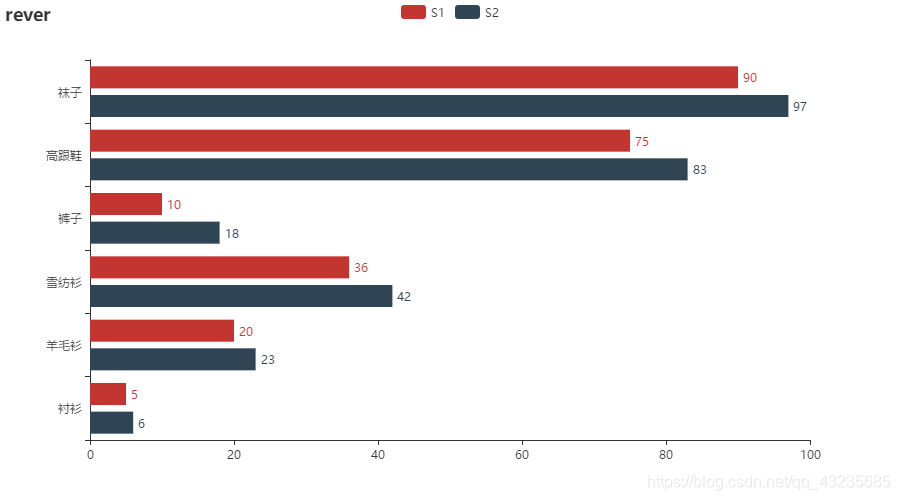
横向bar
bar = Bar()

bar.add_xaxis(xray)
bar.add_yaxis("S1",y1)
bar.add_yaxis("S2",y2)
bar.reversal_axis()
bar.set_global_opts(title_opts=opts.TitleOpts("rever")
                   ,toolbox_opts = opts.ToolboxOpts(is_show = True))
bar.set_series_opts(label_opts=opts.LabelOpts(position = "right"))
bar.render_notebook()
- 1
- 2
- 3
- 4
- 5
- 6
- 7
- 8
- 9
- 10
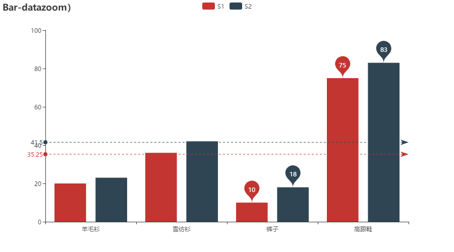
指定特殊点
bar = Bar()

bar.add_xaxis(xray)
bar.add_yaxis("S1",y1)
bar.add_yaxis("S2",y2)
bar.set_global_opts(title_opts=opts.TitleOpts(title="Bar-datazoom)")
                   ,datazoom_opts = opts.DataZoomOpts(type_ = "inside"))
bar.set_series_opts(
    label_opts = opts.LabelOpts(is_show = False)
    ,markpoint_opts = opts.MarkPointOpts(data = [opts.MarkPointItem(type_ = "max",name = "max")
                                                ,opts.MarkPointItem(name = "min",type_ = "min")] # 这里需要注意data是一个系列,就算只有一个也是必须做list处理
                                                )
    ,markline_opts = opts.MarkLineOpts(data = [opts.MarkLineItem(name = "average",type_ = "average")]))
bar.render_notebook()
- 1
- 2
- 3
- 4
- 5
- 6
- 7
- 8
- 9
- 10
- 11
- 12
- 13
- 14
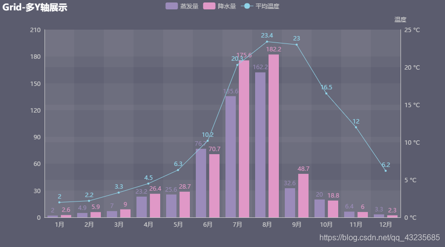
Grid-多 Y 轴示例
x_data = ["{}月".format(i) for i in range(1, 13)]
zengfaliang =  [2.0, 4.9, 7.0, 23.2, 25.6, 76.7, 135.6, 162.2, 32.6, 20.0, 6.4, 3.3]
jiangshuiliang = [2.6, 5.9, 9.0, 26.4, 28.7, 70.7, 175.6, 182.2, 48.7, 18.8, 6.0, 2.3]
average_wendu = [2.0, 2.2, 3.3, 4.5, 6.3, 10.2, 20.3, 23.4, 23.0, 16.5, 12.0, 6.2]

grid = Grid()

bar = Bar()
grid.theme = ThemeType.PURPLE_PASSION
line = Line()

bar.add_xaxis(x_data)
bar.add_yaxis("蒸发量",zengfaliang)
bar.add_yaxis("降水量",jiangshuiliang)
bar.set_global_opts(title_opts=opts.TitleOpts("Grid-多Y轴展示")
                   ,tooltip_opts=opts.TooltipOpts(trigger="axis", axis_pointer_type="cross") # 交叉指向工具
                   )
bar.extend_axis(yaxis=opts.AxisOpts(type_="value",
                                     name="温度",
                                     min_=0,
                                     max_=25,
                                     position="right",
                                     axislabel_opts=opts.LabelOpts(formatter="{value} °C"),
                                     ))
# 在bar上增加Y轴,在line图上选择对应的轴向
line.add_xaxis(x_data)
line.add_yaxis("平均温度",average_wendu,yaxis_index = 1)
# 把line添加到bar上
bar.overlap(line)
# 这里如果不需要grid也可以,直接设置bar的格式,然后显示bar即可
#bar.render_notebook()
grid.add(chart = bar,grid_opts = opts.GridOpts(),is_control_axis_index = True)
grid.render_notebook()
- 1
- 2
- 3
- 4
- 5
- 6
- 7
- 8
- 9
- 10
- 11
- 12
- 13
- 14
- 15
- 16
- 17
- 18
- 19
- 20
- 21
- 22
- 23
- 24
- 25
- 26
- 27
- 28
- 29
- 30
- 31
- 32
- 33
ing
所属网站分类: 技术文章 > 博客
作者:小兔子乖乖
链接:https://www.pythonheidong.com/blog/article/10859/26d4cf383bc272ad1708/
来源:python黑洞网
任何形式的转载都请注明出处,如有侵权 一经发现 必将追究其法律责任
昵称:
评论内容:(最多支持255个字符)
---无人问津也好,技不如人也罢,你都要试着安静下来,去做自己该做的事,而不是让内心的烦躁、焦虑,坏掉你本来就不多的热情和定力