本站消息


python【Matlibplot绘图库】-绘制三维图像
发布于2020-02-24 22:46 阅读(1795) 评论(0) 点赞(17) 收藏(2)

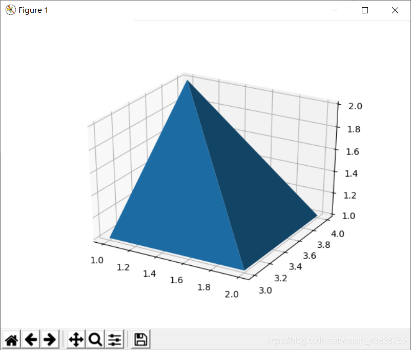
1.绘制三维图像
import matplotlib.pyplot as plt
from mpl_toolkits.mplot3d import Axes3D
fig = plt.figure()
ax = fig.add_subplot(111, projection='3d')
X = [1, 1, 2, 2]
Y = [3, 4, 4, 3]
Z = [1, 2, 1, 1]
ax.plot_trisurf(X, Y, Z)
plt.show()
- 1
- 2
- 3
- 4
- 5
- 6
- 7
- 8
- 9
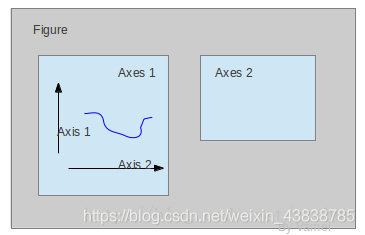
2.plt.axes()
我们先来看什么是Figure和Axes对象。在matplotlib中,整个图像为一个Figure对象。在Figure对象中可以包含一个,或者多个Axes对象。每个Axes对象都是一个拥有自己坐标系统的绘图区域。其逻辑关系如下:
import matplotlib.pyplot as plt
import numpy as np

# create some data to use for the plot
dt = 0.001
t = np.arange(0.0, 10.0, dt)
r = np.exp(-t[:1000] / 0.05)  # impulse response
x = np.random.randn(len(t))
s = np.convolve(x, r)[:len(x)] * dt  # colored noise

# the main axes is subplot(111) by default
plt.plot(t, s)
plt.axis([0, 1, 1.1 * np.amin(s), 2 * np.amax(s)])
plt.xlabel('time (s)')
plt.ylabel('current (nA)')
plt.title('Gaussian colored noise')

# this is an inset axes over the main axes
a = plt.axes([.65, .6, .2, .2], axisbg='y')
n, bins, patches = plt.hist(s, 400, normed=1)
plt.title('Probability')
plt.xticks([])
plt.yticks([])

# this is another inset axes over the main axes
a = plt.axes([0.2, 0.6, .2, .2], axisbg='y')
plt.plot(t[:len(r)], r)
plt.title('Impulse response')
plt.xlim(0, 0.2)
plt.xticks([])
plt.yticks([])

plt.show()
- 1
- 2
- 3
- 4
- 5
- 6
- 7
- 8
- 9
- 10
- 11
- 12
- 13
- 14
- 15
- 16
- 17
- 18
- 19
- 20
- 21
- 22
- 23
- 24
- 25
- 26
- 27
- 28
- 29
- 30
- 31
- 32
- 33

所属网站分类: 技术文章 > 博客
作者:我下面给你吃
链接:https://www.pythonheidong.com/blog/article/232622/e71453a9d3b9e3ed52fd/
来源:python黑洞网
任何形式的转载都请注明出处,如有侵权 一经发现 必将追究其法律责任
17
0
收藏该文
昵称:
评论内容:(最多支持255个字符)
---无人问津也好,技不如人也罢,你都要试着安静下来,去做自己该做的事,而不是让内心的烦躁、焦虑,坏掉你本来就不多的热情和定力
站长公众号(new)
更多>
pdf(new)
更多>
问答(new)
更多>
游戏(new)
更多>