本站消息


TYD_初识python数据可视化库-Matplotlib
发布于2020-02-25 16:59 阅读(1025) 评论(0) 点赞(20) 收藏(4)
目录
基本操作
- import numpy as np
- import matplotlib.pyplot as plt
-
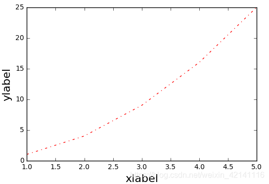
- plt.plot([1,2,3,4,5],[1,4,9,16,25],'-.',color='r') #横标,纵标,线条样式与颜色
- plt.xlabel('xlabel',fontsize = 16)
- plt.ylabel('ylabel',fontsize = 16)
-
图像如下,以及属性值表
子图与标注
标注
- import numpy as np
- import matplotlib.pyplot as plt
-
- x = np.linspace(-10,10,) #linspace是均分计算指令,用于产生x1,x2之间的N点行线性的矢量。其中x1、x2、N分别为起始值、终止值、元素个数。若默认N,默认点数为100。
- y = np.sin(x)
- plt.plot(x,y,linewidth=3,color='b',linestyle=':',marker='o',markerfacecolor='r',markersize=5,alpha=0.4,) #线宽度,颜色,样式,标记点样式,标记点颜色,标记点规格
-
- line = plt.plot(x,y)
- plt.setp(line,linewidth=3,color='b',linestyle=':',marker='o',markerfacecolor='r',markersize=5,alpha=0.4) #这两句话和之前一句效果相同
- plt.text(0,0,'zhangjinlong') #在某个坐标点加文本
- plt.grid(True) #加上网格
- plt.annotate('thisisaannotate',xy=(-5,0),xytext=(-2,0.3),arrowprops=dict(facecolor='red',shrink=0.05,headlength=10,headwidth=10)) #箭头注释,arrow箭头,xy箭头尖端坐标,xytext文本坐标,
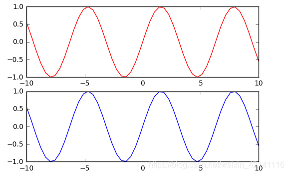
子图
- import numpy as np
- import matplotlib.pyplot as plt
-
- # 211 表示一会要画的图是2行一列的 最后一个1表示的是子图当中的第1个图
- plt.subplot(211)
- plt.plot(x,y,color='r')
-
- # 212 表示一会要画的图是2行一列的 最后一个1表示的是子图当中的第2个图
- plt.subplot(212)
- plt.plot(x,y,color='b')
风格
 bmh风格
bmh风格
- x = np.linspace(-10,10)
- y = np.sin(x)
- plt.style.use('bmh') #使用这种风格
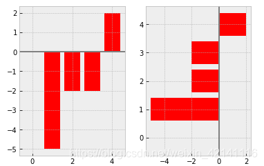
条形图
- np.random.seed(0)
- x = np.arange(5)
- y = np.random.randint(-5,5,5)
- print(y)
- fig,axes = plt.subplots(ncols=2) #两个图,分占两列。如果没有参数则只有一个图。,返回一个包含figure和axes对象的元组
- v_bars = axes[0].bar(x,y,color='red') #条形图按行画,返回元组中axes用得较多
- h_bars = axes[1].barh(x,y,color='red') #条形图按列画
-
- axes[0].axhline(0,color='grey',linewidth=2) #画横轴线
- axes[1].axvline(0,color='grey',linewidth=2) #画纵轴线
-
- fig,axes = plt.subplots()
- v_bars = axes.bar(x,y,color='lightblue')
- for bar,height in zip(v_bars,y): #zip() 函数用于将可迭代的对象作为参数,将对象中对应的元素打包成一个个元组,然后返回由这些元组组成的列表。
- if height<0:
- bar.set(edgecolor='darkred',color='red',linewidth=3) #画一个条形图,对其中值小于0的单独设置风格
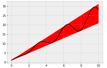
- x = np.linspace(0,10,200)
- y1 = 2*x+1
- y2 = 3*x+1.2
- y_mean = 0.5*x*np.cos(2*x)+2.5*x+1.1
- fig,ax = plt.subplots()
- ax.fill_between(x,y1,y2,color='red')
- ax.plot(x,y_mean,color='black')
条形图细节
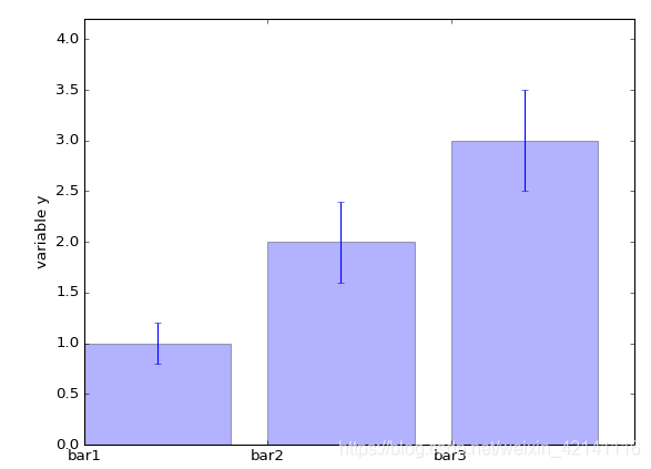
- mean_values = [1,2,3]
- variance = [0.2,0.4,0.5]
- bar_label = ['bar1','bar2','bar3']
-
- x_pos = list(range(len(bar_label))) #list将元组转换为列表
- plt.bar(x_pos,mean_values,yerr=variance,alpha=0.3) #绘图,参数分别为横标,纵标,误差帮,透明度
- max_y = max(zip(mean_values,variance)) #两个数组传入,返回两个最大值
- plt.ylim([0,(max_y[0]+max_y[1])*1.2]) #乘以1.2留白部分
- plt.ylabel('variable y') #y轴名字
- plt.xticks(x_pos,bar_label) #x轴的位置以及每个位置的标签
- plt.show()
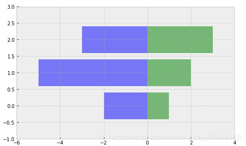
- x1 = np.array([1,2,3])
- x2 = np.array([2,5,3])
-
- fig = plt.figure(figsize=(8,5)) #图像的长度和宽度
- y_pos = np.arange(len(x1))
-
-
- plt.barh(y_pos,x1,color='g',alpha=0.5)
- plt.barh(y_pos,-x2,color='b',alpha=0.5)
-
- plt.xlim(-max(x2)-1,max(x1)+1) #对四方留白的设置
- plt.ylim(-1,len(x1))
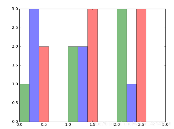
- green_data = [1, 2, 3]
- blue_data = [3, 2, 1]
- red_data = [2, 3, 3]
- labels = ['group 1', 'group 2', 'group 3']
-
- pos = list(range(len(green_data)))
- width = 0.2
- fig, ax = plt.subplots(figsize=(8,6))
-
- #重点关注第一个元素的定位
- plt.bar(pos,green_data,width,alpha=0.5,color='g',label=labels[0])
- plt.bar([p+width for p in pos],blue_data,width,alpha=0.5,color='b',label=labels[1])
- plt.bar([p+width*2 for p in pos],red_data,width,alpha=0.5,color='r',label=labels[2])
条形图外观
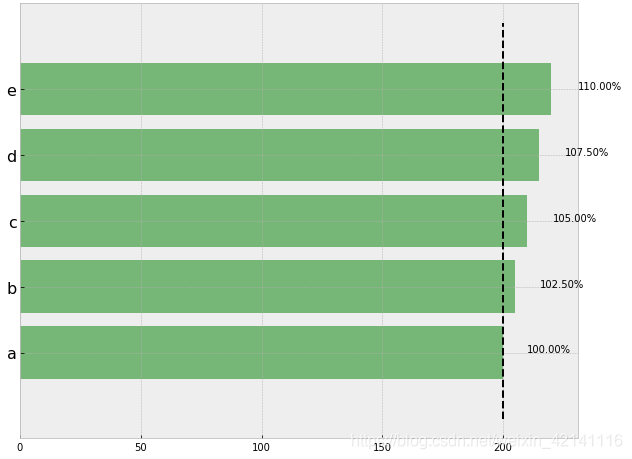
- import matplotlib.plot as plt
-
- data = range(200, 225, 5)
- bar_labels = ['a', 'b', 'c', 'd', 'e']
- fig = plt.figure(figsize=(10,8))
- y_pos = np.arange(len(data))
- plt.yticks(y_pos, bar_labels, fontsize=16) #给y轴加刻度
- bars = plt.barh(y_pos,data,alpha = 0.5,color='g') #注意这里是barh所以是给y轴标数据
- plt.vlines(min(data),-1,len(data)+0.5,linestyle = 'dashed') #-1代表图形下方的空间,len(data)代表上方
- for b,d in zip(bars,data):
- plt.text(b.get_width()+b.get_width()*0.05,b.get_y()+b.get_height()/2,'{0:.2%}'.format(d/min(data)))
- plt.show()
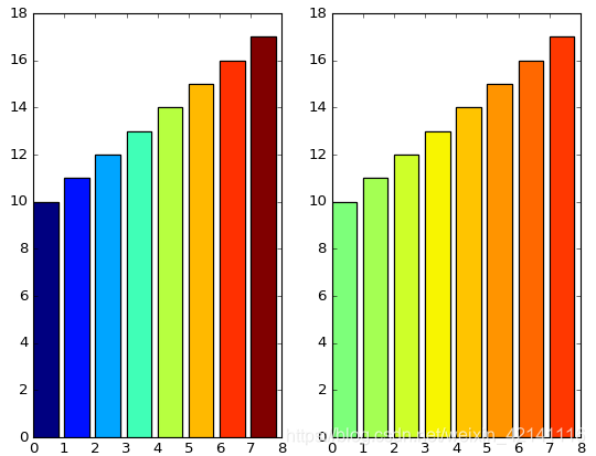
- import matplotlib.plot as plt
- import matplotlib.colors as col
- import matplotlib.cm as cm #彩色地图
-
-
- mean_values = range(10,18)
- x_pos = range(len(mean_values))
-
- cmap1 = cm.ScalarMappable(col.Normalize(min(mean_values),max(mean_values),cm.hot))
- cmap2 = cm.ScalarMappable(col.Normalize(0,20,cm.hot))
-
- plt.subplot(121)
- plt.bar(x_pos,mean_values,color = cmap1.to_rgba(mean_values))
-
- plt.subplot(122)
- plt.bar(x_pos,mean_values,color = cmap2.to_rgba(mean_values))
-
- plt.show()
- patterns = ('-', '+', 'x', '\\', '*', 'o', 'O', '.')
-
- fig = plt.gca()
-
- mean_value = range(1,len(patterns)+1)
- x_pos = list(range(len(mean_value)))
-
- bars = plt.bar(x_pos,mean_value,color='white')
-
- for bar,pattern in zip(bars,patterns):
- bar.set_hatch(pattern)
- plt.show()

盒图绘制
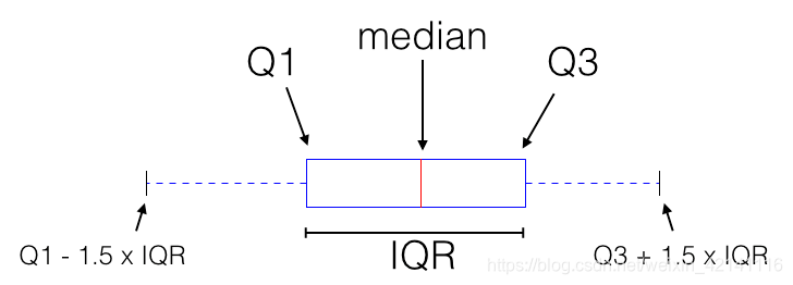
盒图细节如上,median为中位数,Q1为左边的中位数,同理Q2,在边界外的数称之为离群点。
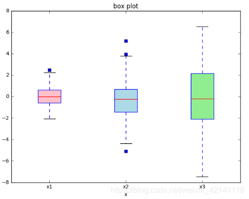
- import matplotlib.pyplot as plt
- import numpy as np
- %matplotlib inline
-
-
- zhang_data = [np.random.normal(0,std,100) for std in range(1,4)] #构造3个正态分布数据,每个一百个点,均值都为0,方差1到3
- fig = plt.figure(figsize=(8,6))
- bplot = plt.boxplot(zhang_data,notch=False,sym='o',vert=True,patch_artist=True) #绘制盒图,sym表示离群点的表示方法,vert表示是否是竖直绘图,notch表示v型刻痕,patch_article表示是否填充箱体颜色
-
- plt.xticks([y+1 for y in range(len(zhang_data))],['table1','table2','table3']) #x轴贴标签,range是从零开始的所以y+1
- plt.xlabel('x')
- plt.title('box plot')
-
- colors = ['pink','lightblue','lightgreen']
- for pathch,color in zip(bplot['boxes'],colors):
- pathch.set_facecolor(color)
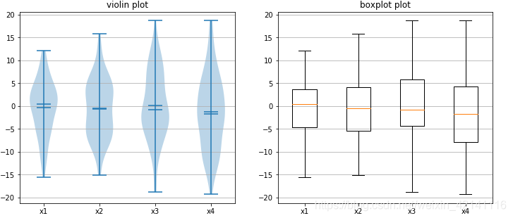
小提琴图
- import matplotlib.pyplot as plt
- import numpy as np
- %matplotlib inline
-
-
- fig,axes = plt.subplots(nrows=1,ncols=2,figsize=(12,5))
- data = [np.random.normal(0,std,100) for std in range(6,10)]
- axes[0].violinplot(data,showmeans=True,showmedians=True)
- axes[0].set_title('violin plot')
-
- axes[1].boxplot(data)
- axes[1].set_title('boxplot plot')
-
- for ax in axes:
- ax.yaxis.grid(True)
- ax.set_xticks([y+1 for y in range(len(data))])
- plt.setp(axes,xticks=[y+1 for y in range(len(data))],xticklabels=['x1','x2','x3','x4'])
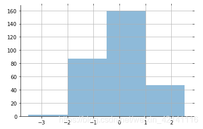
绘图细节设置
- import math
- x = np.random.normal(loc=0.0,scale=1.0,size=300)
- width = 0.5
- bins = np.arange(math.floor(x.min())-width,math.ceil(x.max())+width,width) #横标左右两边留白,最后一个参数代表每个网格的宽度
- ax = plt.subplot(111) #因为只有一个图,所以参数不能设置为subplots
-
- ax.spines['top'].set_visible(False) #spines 脊椎,去掉上横线
- ax.spines['right'].set_visible(False)
-
- plt.tick_params(bottom='off',top='off',left='off',right='off') #去掉轴上的锯齿
- plt.grid()
- plt.hist(x,alpha=0.5,bins=bins) #绘制直方图
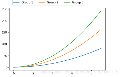
- ax = plt.subplot(111)
-
- x = np.arange(10)
- for i in range(1,4):
- plt.plot(x,i*x**2,label='Group %d'%i)
- ax.legend(loc='upper canter',bbox_to_anchor=(0.8,1.15),ncol=3) #legend图例的意思,anchor锚,
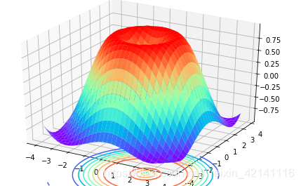
3D图
- import matplotlib.pyplot as plt
- import numpy as np
- from mpl_toolkits.mplot3d import Axes3D #注意不要写错了
-
- fig = plt.figure() #创建一个图形实例
-
- #绘制3D图形有两种方法 第二种是 ax = fig.add_subplot(111, projection='3d')
- ax = Axes3D(fig)
-
- x = np.arange(-4,4,0.25)
- y = np.arange(-4,4,0.25)
- X,Y = np.meshgrid(x,y) #绘制网格
- Z = np.sin(np.sqrt(X**2+Y**2))
- ax.plot_surface(X,Y,Z,rstride=1,cstride=1,cmap='rainbow') #绘制面(bar绘制直方图,scatter绘制散点图),rstride 和cstride控制面方形粒度
- ax.contour(X,Y,Z,zdim='z',offset=-2,cmap='rainbow') #绘制等高线
- plt.show()
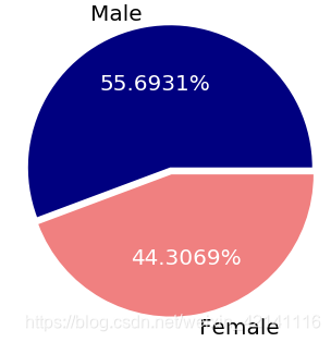
pi图
- import matplotlib.pyplot as plt
- %matplotlib inline
-
- #数据
- m = 51212.
- f = 40742.
- m_perc = m/(m+f)
- f_perc = f/(m+f)
- colors = ['navy','lightcoral']
- labels = ["Male","Female"]
-
- plt.figure(figsize=(6,6))
- paches,texts,autotexts = plt.pie([m_perc,f_perc],labels = labels,autopct='%1.4f%%',explode=[0,0.05],colors=colors)
- #autopct='%1.4f%%'表示数据表示格式,小数点后保留四位,explode表示子饼间距
-
- for text in texts+autotexts:
- text.set_fontsize(20)
- for text in autotexts:
- text.set_color('white')
子图布局
- ax1 = plt.subplot2grid((3,3),(0,0),rowspan=3) #span是跨度的意思,跨行。
- ax2 = plt.subplot2grid((3,3),(0,1),colspan=2)
- ax3 = plt.subplot2grid((3,3),(1,1))
- ax4 = plt.subplot2grid((3,3),(1,2))
- ax5 = plt.subplot2grid((3,3),(2,2))

嵌套图
- import numpy as np
-
- x = np.linspace(0,10,1000)
- y2 = np.sin(x**2)
- y1 = x**2
-
- fig,ax1 = plt.subplots() #第一个返回值是在某一个图中设置,第二个是跨图设置
- left,bottom,width,height = [0.22,0.45,0.3,0.35]
- ax2 = fig.add_axes([left,bottom,width,height]) #注意这里用到了ax1
-
- ax1.plot(x,y1)
- ax2.plot(x,y2)

- import matplotlib.pyplot as plt
- from mpl_toolkits.axes_grid1.inset_locator import inset_axes
-
- #传入一个条形图函数的返回值,bar函数除了绘图以外,还会返回一个由每个竖条组成的数组?
- def autolabel(rects):
- for rect in rects:
- height = rect.get_height()
- ax1.text(rect.get_x()+rect.get_width()/2.,1.02*height,"{:,}".format(float(height)),ha='center',va='bottom',fontsize='18')
-
- #数据
- top10_arrivals_countries = ['CANADA','MEXICO','UNITED\nKINGDOM',\
- 'JAPAN','CHINA','GERMANY','SOUTH\nKOREA',\
- 'FRANCE','BRAZIL','AUSTRALIA']
- top10_arrivals_values = [16.625687, 15.378026, 3.934508, 2.999718,\
- 2.618737, 1.769498, 1.628563, 1.419409,\
- 1.393710, 1.136974]
- arrivals_countries = ['WESTERN\nEUROPE','ASIA','SOUTH\nAMERICA',\
- 'OCEANIA','CARIBBEAN','MIDDLE\nEAST',\
- 'CENTRAL\nAMERICA','EASTERN\nEUROPE','AFRICA']
- arrivals_percent = [36.9,30.4,13.8,4.4,4.0,3.6,2.9,2.6,1.5]
-
-
- fig,ax1 = plt.subplots(figsize=(20,12))
- zhang = ax1.bar(range(10),top10_arrivals_values,color='blue') #返回的是元组或者列表什么的
- plt.xticks(range(10),top10_arrivals_countries,fontsize=18)
- ax2 = inset_axes(ax1,width=6,height=6,loc='upper right') #关键步骤,实现在bar图中嵌入饼图 loc属性和饼图的位置有关
- explode = (0.08, 0.08, 0.05, 0.05,0.05,0.05,0.05,0.05,0.05)
- patches,texts,autotexts = ax2.pie(arrivals_percent,labels = arrivals_countries,autopct='%1.3f%%',explode=explode)
-
- for text in texts+autotexts:
- text.set_fontsize(16)
- for spine in ax1.spines.values():
- spine.set_visible(False)
-
- autolabel(zhang)


所属网站分类: 技术文章 > 博客
作者:阿里妈妈
链接:https://www.pythonheidong.com/blog/article/233608/ee6bd9d03a8e306d85cf/
来源:python黑洞网
任何形式的转载都请注明出处,如有侵权 一经发现 必将追究其法律责任
20
0
收藏该文
昵称:
评论内容:(最多支持255个字符)
---无人问津也好,技不如人也罢,你都要试着安静下来,去做自己该做的事,而不是让内心的烦躁、焦虑,坏掉你本来就不多的热情和定力
问答(new)
更多>
游戏(new)
更多>